When it comes to the creation of an elegant home, even the slight change turns out to be beautiful or the opposite. Managing the balance, forming up the theme, taking care of the furniture, all these have to be concerned. Interior mistake are very often in house but we should always be vigilant about it. In this blog, you will get to know about the common 5 interior mistake that make your house dull.
#1; Do Not Block Any Window
Natural Lighting will always adore the house in a very different way. Insufficient lighting inside the house seems to be always dull and hostile. Windows are the primary source for lighting inside the house. Blocking the windows with furniture would be a great mistake in interiors.
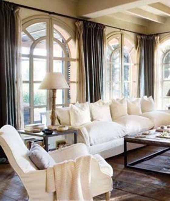
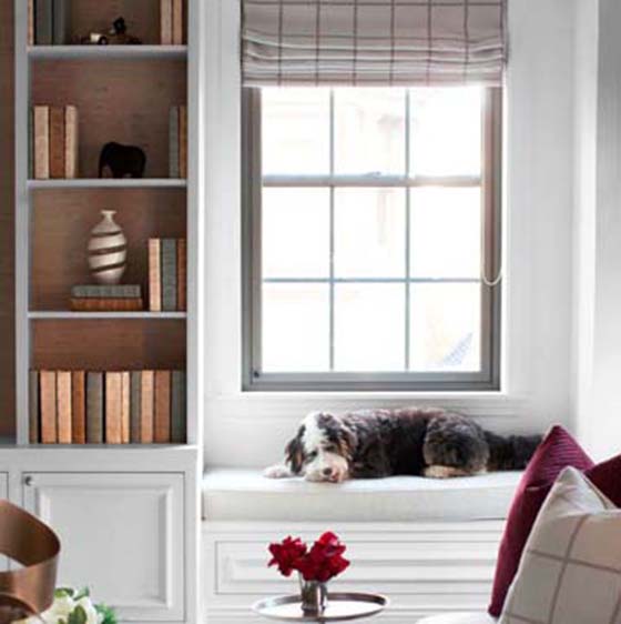
Always keep low height furniture adjacent to the window such that proper natural lighting will be filled in the house, not only lighting this will maintain more airflow inside the house.
#2; Do Not Keep Furniture Close to the Wall
Every homeowner will tend to keep the furniture close to the wall just by trusting the fact that it gives out more space inside the house, quite a common misunderstanding. Keeping furniture against the wall will decrease the organic flow of space within the house; it leads to a lack of visual interest.
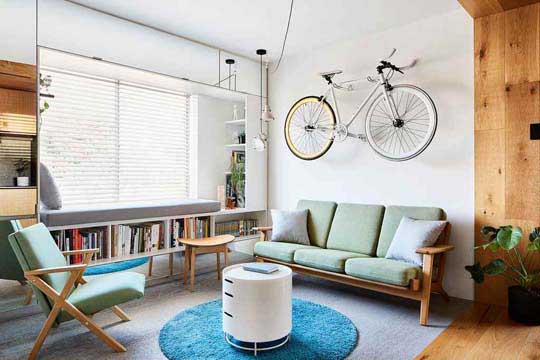
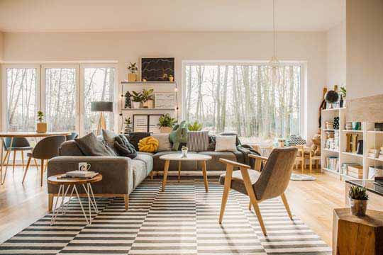
Should always create a focal point inside the room, such that more space and visual interest of the room also will increase. Do not point over the corner for keeping the furniture; corner always fit for artificial living room accessories.
#3; SCALING MATTERS
Scaling is the most important aspect of interiors. When we don’t do scaling, the room would look either congested or spacious, which may ruin the entire interior. Scale the room and occupy the furniture accordingly. For a huge living room with a high ceiling; floor cushion or leaner pieces won’t be good enough; instead, we can use of L- shaped sofa.
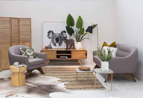
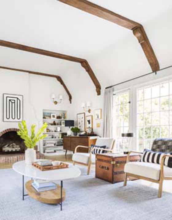
In the case of a small living room, we should use the leaner type of furniture, and use the accessories that fit in the space. Scaling would help to avoid the clumsiness of the interior.
#4; Avoid Too Much of Accent Walls
The accent wall is supposed to be the focal point of the room. They should be elegant and most attractive, and for this, we should not use deep colors and more focal points in the wall, which makes the room darker and dull. This could be the common interior mistakes.
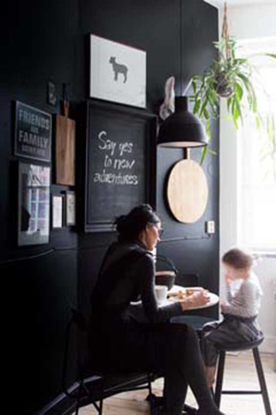
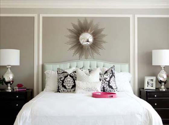
For simple and elegant walls, the accent should be small, and they shouldn’t be more than one accent wall so that it defeats the term accent.
#5; Over Accessories Ruins Interior
Too many accessories can kill the décor. The accessories are used to complement the décor not to steal the entire show. When we crowd the room with too many cushions, rugs, or wall accessories, they will eat up and absorb the light inside the room.
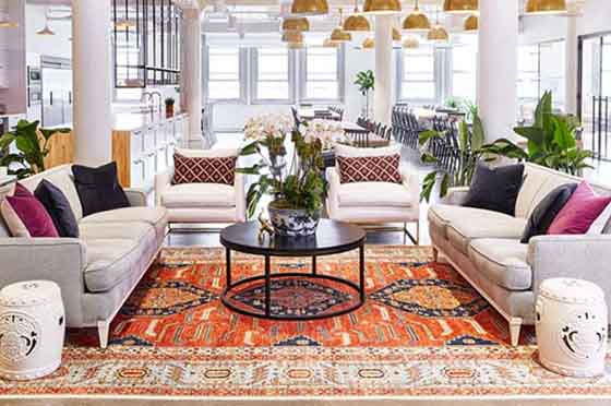
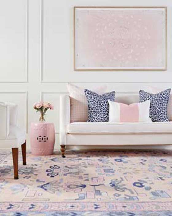
Choose accessories like we choose the furniture and wall paints, such that we can use space judiciously. Try to purchase the different accessories so that, in rotation, it can change the entire look of the room.


